
Navigating extensive documentation can be agonizing with a massive amount of sections. Authors don’t have time to read everything they see word by word to find what is applicable for them. Thus, scannability to quickly locate relevant content, to begin editing within seconds, is an essential factor to usability within the Fonto Editor.
So what have we improved in this area, and how will it help your end-users?
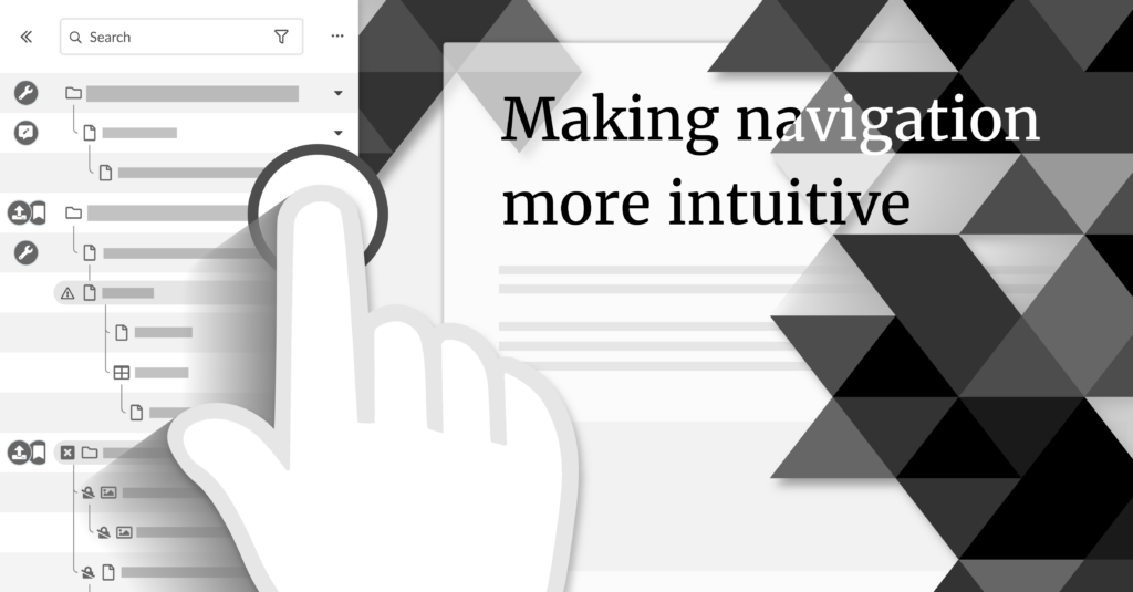
We’re moving the Outline to the left
By placing the outline on the left side of the screen, we are making the natural flow of editing and reviewing documents more intuitive. The first action an author needs to take when accessing the Fonto Editor is to locate the content that is relevant for them. Most people are used to reading content from left to right and will intuitively look on the left side first to discover important elements. The table of contents is also generally known to be on the left side in other editors, such as in Word.
Once the author has found the content they need, they are ready to start writing. The Outline can then be used alongside the content while utilising any supportive information on the right side of the screen. This will help authors maintain an overview of related content and let them quickly jump between sections. This ability has been asked for on numerous occasions.
Scan and navigate the Outline faster
To guide the user in an easy path of scannability we have designed a more effective visual hierarchy that makes the levels of content priority clear. It enables the user to scan the list quickly to locate the content they want in split seconds.
Based on Gestalt theory, we have organised elements so that the author can distinguish the information on the basis of their physical differences, such as size, colour, contrast and shape. Ordering content elements by this principle often lets a user take action faster than a user can read the title or see all the details.
We have also arranged elements to minimize the amount of effort required for a person to move a mouse cursor to a target area. Actions that are frequently used are placed close to the content. This makes for a faster and more ergonomic way of working when alternating between navigating and typing.
Working on a smaller screen?
Another cornerstone in creating intuitive and user-friendly navigation is to make sure that it is also useful when working on a smaller screen. With a new nifty feature, authors will be able to navigate and receive status updates to sections, with the Outline collapsed down to the width of a finger. Allowing authors to stay productive on any screen size.
How to upgrade?
The improved Outline is included with Fonto 8 automatically – no need to schedule extra time simply to use it. The layout of the UI has, however, changed so if you do provide any training material for your end-users then we do recommend updating it for this release.
All new features are backwards compatible with your existing configuration. If you do update your configuration, to again be more future proof, then we estimate the work to be less than 15 minutes of effort. We will also keep backwards compatibility in place for another half a year.
If you have 15 minutes to spare then we do recommend that you consider the new or improved Outline configuration options; Icons and label abbreviations for node status badges, extending the “…” menu for the whole Outline, or using the new Outline toolbar area for any other UI that you find relevant. Icons and label abbreviations are recommended for anyone already using node status badges. Find our API documentation for more details!
We want to hear your thoughts. Leave a comment below or submit your feedback using the private form on the Fonto 8.0 page.